A great design counts for very little if sent to print in the wrong format. Indeed deciding what graphics or visuals to lead with is but half the battle. Of equal importance is preparing said files correctly and ensuring they are print ready – saving you time and money in the long-run.
Experienced graphic designers are well versed in creative software and know all about bleeds, trims, colour codes and more. Budding artists however can often struggle to comprehend such extensive new terminology, thus learning a painful lesson when greeted with a less than satisfactory print. Few make the same mistake twice.
In order to educate those intending to print for the very first time however we have put together what we deem to be some essential guidance.
Colours
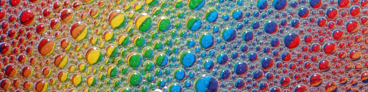
Colour seems as good a place as any in which start. Understanding the difference between CMYK and RGB files is important. The former relates to a four colour process made up of Cyan, Magenta, Yellow and Black. Each is required in any print head, conspiring to offer a full palette. Yellow and magenta for instance will facilitate red. It is vital to convert all images and colours to CMYK when saving files for print.
As for RGB this stands for Red, Green and Blue – the colours of light a computer screen blends in order to form colours upon it. We cannot however trust our monitors when gearing up for digital printing. Slight adjustments to the likes of contrast and brightness will generate colours which will be near impossible to replicate when printed. Wherever possible match colours to a reliable pantone reference or CMYK mixer chart.
Black and grey come with their own guidelines too.
There are two types of black when printing a process colour document. First we have Black (100% K) which is best deployed for use in body text or when generating barcodes. The alternative type is titled Rich Black (40 C 30M 30 Y 100 K) and will ordinarily be introduced when creating blocks of black evidenced in the likes of headlines.
Neutral shades of grey meanwhile are best realised using straight tints of black.
On the subject of tints, set them to be no less than 10%. It is worth noting that along with areas of solid colours and bleeds they reproduce better if subjected to filtering techniques at the design stage.

Image Quality
Before heading to print it is advisable to save all images at 300dpi (dots per inch). The latter is a quality measurement for print work and dipping below 200dpi will almost certainly result in disappointing quality.
Some fall into the trap of adjusting resolutions in the likes of photoshop, hoping to enhance designs. This is actuality a pointless exercise as it is impossible to add resolution to an image. A sizable proportion of print work, the likes of window and standard stickers for instance, are created using 300dpi. Larger print files may scale 150dpi but a lower resolution generally equates to a lower quality.
Be mindful also that an increase in size comes at the expense of resolution and vice-versa.
Beware of lifting images from the internet. In most instances saving a pretty picture from another website will be in breach of copyright.
Another reason web images should come with hazard lights is the fact they are saved at a lower resolution, one set to improve load speeds. Seldom will a web page boast a picture greater than 72dpi which, as stated earlier, is of little to no use in the print world.
A cheat of sorts does exist when adopting vectors. The latter, significantly, are not resolution dependent. Consequently, logos presented in this form will not see their quality diminished if re-sized separately.
Size matters. Do not naively think a Facebook cover photo will make for a good display banner. Always check dimensions and download templates readily available to guard against complacency.
Formatting
When finalising your document be sure to include the following elements:
Time Line: This, quite simply, refers to the finished size of the piece and denotes the end of the document itself.
Live Area: The centrepiece of your design; the area reserved for its main detail.
Bleed: This refers to the edge of a document, one that gets trimmed off after printing occurs. Designers are encouraged to make artwork larger than originally intended so it can be trimmed down to the correct size thereafter.
Failure to include a bleed line will result in an unwelcome white border appearing around the artwork. Worse still printers will likely trim the job under size, cutting into the image detail and thus under delivering. The standard bleed within the large format digital print industry tends to be 3mm; while borders are closer to 5mm.
When readying your document ensure the page size is the exact size of the trimmed finished object. There are of course notable exceptions to this rule, namely documents such as folders, which contain intentional folds.
Crop Marks: An indication on precisely where to cut the printed substrate.

Software
Design programs are rightly versatile but each have an area in which they excel. Photoshop, unsurprisingly, is ideal for photographs. Montages, scanned images and general digital photography are best delivered this fashion.
Elsewhere text documents are better served within Microsoft Word, WordPad or Notepad respectively, this due to them generally containing less of a creative edge.
When handling logos or display text in vector form Adobe Illustrator is your friend.
Finally everything from display items to stationary can be setup for print in one of Adobe InDesign or a print ready PDF.
Saving for files
Save files in the format associated with the program they were created in. In other words, Photoshop designs should include the extension .psd, Illustrator .ai and so on.
Those planning to overlay logos should seek to do so using vectors. Why? Because these are transparent and lend themselves to this very process as a result.
Finally, if adopting PDF to supply print ready files remember to centre the document with crop marks and have all fonts embedded. Just as significant is delivering single pages, avoiding spreads or double-sided layouts.
Any graphics contained within a design meanwhile should be linked rather than embedded. One of printers’ great frustrations is receiving artwork with links missing. It is therefore recommended you perform what is termed a ‘collect for output’ or ‘package’ whenever a visual is finalised. This process will create a folder containing your document, but added to it all associated links and fonts. Combining them in this manner will ensure graphics, images and all other components are grouped together, sparing you awkward conversations down the line.
Sound advice is to avoid renaming files after they have been saved a first time. This can lead to links failing at a later date. Common sense also tells us to keep backups!
By way of an introduction, the above rules should hold you in good stead when preparing to submit designs for digital printing. Adhere to them and you will not go far wrong.
