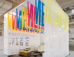
If we asked you what printing means to you, you would be forgiven for thinking of the desk jet at home or the noisy laser jet in the office.
Needless to say printing as an industry is infinitely more complex and varied and goes beyond flyers, business cards or anything else you might find on Vistaprint.
Marketing your business using high quality collateral sets you apart from your competitors just as having a premium website does. Having a tangible presence makes an impact.
Because of this, it’s critical to ensure that any physical form of communication be it signage or a display stand is not only eye-catching but also accurately reflects your business, its objectives, culture, tone of voice and more.
To help you out, we’ve compiled a list of 5 important questions every passionate marketer should be asking themselves before creating printed marketing assets.
1. Who is this aimed at?

Who do you want to reach? If you’re attending an exhibition the answer isn’t everyone, although it’s tempting. You want to go after the people who you are going to work best with: companies of a certain type in specific markets.
More than that however, what are you trying to communicate? Whether you need an exhibition stand, a billboard ad, a hoarding or a simple display banner, you have to know what you’re trying to say to whom nailed down before you get too far into the design process.
Trying to be all things to all people is a great way of confusing your message and you’ll end up not really saying anything at all.
Understand your unique selling points, nail down the key brand design elements and then make it big, bold and clear.
2. Does this comply with my brand guidelines?
Another crucial element of any printed marketing collateral is whether or not it complies with your brand guidelines.
Your guidelines should include information such as:
- Logo/icon design and usage
- Fonts and typographical elements
- Image and photography styles (such as editing styles or use of black & white)
- Colour palette (with relevant CMYK and/or pantone codes)
Every shred of company material, internal or external, should adhere to these guidelines in order to maintain consistency between every interaction a potential customer has with your business.
3. Does this solve a problem?
We live in the age of content marketing and this requires businesses to move away from the antiquated “sell sell sell” approaches and, instead, favour more educational, helpful styles of interaction.
By solving a problem or addressing a typical pain point of your audience, you will be able to cement your business in their minds and establish yourself as a company which really knows what they’re doing and wants the best for their customers.
Whilst you may not be able to implement this style as extensively in certain collateral (for instance, it’s unlikely you’ll be including a 500 word blog on a prop stand, it is important to use this wherever possible.
Emphasise the benefits rather than the features.
This will help to engage with your audience on their level and avoid the all-too-common product rants.
4. Am I using the correct medium?
Another area which is easy to overlook: there is a wealth of different materials and finishes available which can potentially enhance the look of your communications.
The materials available mean that your exhibition stand or exterior signage doesn’t have to be the conventional. Thanks to some amazing technology you can use routed lettering, printed acrylic or even wood.
Although it’s important at this point to remember to stay true to your branding as it’s all too easy to run too fast and go off too far. Before you know it you’ve come up with something amazing but fails to do the job.
As with any element of design, choosing the right material can be a fantastic way to differentiate you from the competition.
5. Will the quality be good enough?

This may seem like an obvious one but make sure that both the design you’re created and the technology you’re using is up to the task.
Using sub-standard technology could provide short term savings but can also result in pixelated imagery, blurred text and other printing artefacts.
By investing in a professional printing service, you can provide your customers with high quality marketing material which really reflects your business and leaves people feeling impressed as well as educated.
Getting the most out of printed marketing collateral
Asking yourself these 5 questions will help you to take a deeper look at your business’s objectives when producing a printed product.
Ensuring your marketing assets are compliant with the values and brand guidelines of your company as well as being helpful and beautiful is crucial but, also, entirely achievable.


