Infographics are synonymous with digital media but were a popular form of content marketing long before the advent of computers.
A graphical means of communicating a message, instruction or process, this kind of design is as impactful as it is timeless.
Why? Because visual information resonates far quicker than the text equivalent.
For that reason, infographics will always have a place offline, just as much as they do on the world wide web.
What Are Infographics Used For?
We encounter infographics every day.
They’re commonplace on websites, social channels, mobile apps and television. The chances are the last news broadcast you watched featured just this kind of design, detailing the sequence of certain events.
Yet infographics are not exclusive to digital and electronic platforms.
Indeed, traditional marketing relies heavily on this kind of creative, given it lends itself to printed leaflets, pull up banners and the like.
This was never more apparent than during the height of the Coronavirus pandemic. Doctor’s surgeries were kitted out with displays/infographics outlining steps to contain the virus – from hand washing to face coverings. They became a crucial piece of collateral and will remain so for however long COVID-19 remains transmissible.
Whatever the medium, the purpose of such designs is the same. Convey key information quickly, in a format that is both visually appealing and easy to compute.
How To Print Infographics
Anyone looking to print an infographic should opt for wide format printing, offered by the likes of Evans Graphics.
When preparing a document, it serves to save the file as a pdf, as this is far easier to reproduce than a standard png. It also guarantees a higher quality of output. As such, it is preferred by professional printers the world over.
Which material you select will depend on the nature of the infographic itself and moreover its eventual location.
One planned for a pull up banner is best realised through vinyl or mesh, given these substrates pair durability with a light weight.
A standard poster is best printed onto weatherproof thin gauge PVC, for obvious reasons.
A display board meanwhile can be recreated on anything from aluminium to Tyvek.
Researching potential materials or even requesting a sample pack, will hold you in good stead.
Infographic Design Considerations
Sequencing
Before settling on the colours, fonts and shapes sure to capture the imagination, it serves to plan the message you’re looking to share within the infographic.
What information needs to be shown and in what order? Remember, less is often more – particularly if you’re hoping to pique the interest of passersby.
Where possible, try to stick to 5-6 steps so not to overwhelm.
If this simply isn’t possible, consider what format you’re going to use to ensure the lengths of the design doesn’t intimidate.
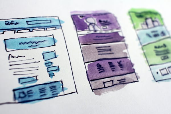
A single column, containing stacked points, works for shorter sequences but two or three columns allow for further detail. A mind map allows for even greater flexibility.
A good infographic is akin to a customer journey map. The objective is to take people from start to finish.
Sizing
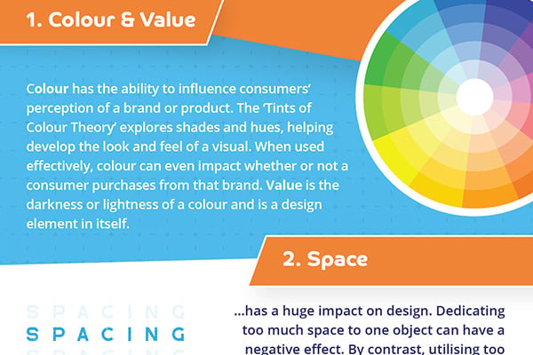
Once these details are agreed upon you’ll have a better idea on a suitable aspect ratio. Infographics can be anything from vertical, to square to horizontal. The latter is popular for offline collateral like billboards, documents and posters.
There is no right or wrong answer here and most professional printers will accommodate all dimensions. Just be sure to settle on the size that has the maximum impact.
Headings
Too often relegated to an after-thought, a compelling title sets the tone for an infographic. Remember, you have milliseconds to state what it is your design is talking about – if that isn’t already obvious. Ensure your headline stands out and leaves no doubt.
Colour Scheme
It goes without saying colour will play a key role in the appearance of and reaction to your infographic. The best designs incorporate two to three hues, supplemented by accents.
Industry and tone should always have a bearing here. More informative, business-like designs will adopt neutral colours. By contrast, more salesy, light-hearted interpretations will throw caution to the wind and utilise bright, even garish palettes.
Always remember to pair hues that make the overall message clear and easy to process. Never make people work to understand what it is your saying. White space is your friend in this respect. Include plenty of it.
What other tactics help an infographic to stand out? Well incorporating a degree of contrast certainly helps. Bold colours are always going to stand out more against a white background, others simply complement each other well and draw attention because of that blend.
Graphics
Depending on the type of infographic, you may seek to show comparisons. Certain chart types are better for this than others, as they are in any basic Excel document.
Are you looking to depict statistics, growth or a share of something? Give careful consideration to bar graphs, tree maps, pie charts and scatter diagrams for these purposes. Decide whether you can add your own spin to them.
Typography
While font is clearly a key consideration, remember in an infographic typography should always play second fiddle to graphical elements. The clue is in the name, after all.
Try and communicate as much information as possible through visuals. Pair those with minimal text.
A growing number of designers are embracing contrasting typography in a bid to make their infographics stand out. This is a high risk-high reward strategy, providing text remains legible. It’s very easy to go a step too far and confuse an audience.
One useful tip is to adopt different font sizes throughout, beginning with a large heading, followed by a subheading, then smaller detail text and so on.
This approach could be compared to the inverted pyramid metaphor used by newspaper journalists. An unwritten rule is to include the most important information at the top and gradually work your way down.
That said, it’s also important to retain a degree of symmetry throughout a design, particularly if yours is a comparison. When pitting two products against each other, for example, both should be afforded equal weight and/or billing.
Graphics
Visual elements themselves can take various forms. A growing number of infographics now contain actual photography, around which summary text is dotted. Think of a typical museum tour. The likelihood is your favourite artefact will be flanked by an infographic detailing its chartered history.
Iconography also works well in this format, so too animation.
Creativity rules, meaning there are no strict design guidelines. Ultimately however you want to include elements that look like they ‘pop’ so as to catch the eye.
Designs evolve but infographics never go out of fashion. A staple of any good digital marketing campaign they remain every bit as effective offline as they do a cutting-edge website. If you place as much emphasis on footfall as click-through-rates, we’d suggest printing your own.
