Whilst it’s not an everyday occurrence there are times when you need to go big. Big being a billboard, an events banner or similar.
It can be an intimidating experience as it’s not like the finished product will be easy to miss. So in addition to the design needing to look great, it also has to look great on a large canvas.
It’s easy to let the size of the canvas get the better of you, the space feeling seemingly endless. However, some of the best billboards and banners out there keep things very simple.
The space is used to make a maximum impact to as many people as possible whether they’re ten feet or a hundred feet away in the most immediate way it can.
The simpler the design the more people can and will see it. Below is an example of one of the banners for the Batman: Arkham Origins game released in 2013.
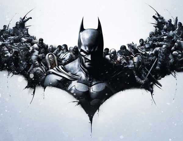
The reason it works so well is, from afar, it looks like a heavily stylised Bat-symbol. This is something that has become increasingly synonymous with the Bat-brand and resonates with the fans. It’s also one of the most recognised logos in the world.
However, the closer the audience gets to the banner the more details become apparent, specifically Batman being beset on all sides by villains including some fan favourites, like the Penguin and Deathstroke.
The Dark Knight aside, the lesson is a good one. The bigger the impact: the bigger the audience.
Here are our top tips for designing for large print:
Balance
Banners are meant to be seen, interpreted and digested quickly. They’re either on the side of the road where road users or pedestrians can absorb the information as they go past or impactful enough to attract passers-by towards a particular event.
Either way keeping your design free of lots of complex images and text is an important first step. If your audience only reads or understands half the message by the time they’ve driven (or worse, walked) passed then the banner hasn’t done its job.
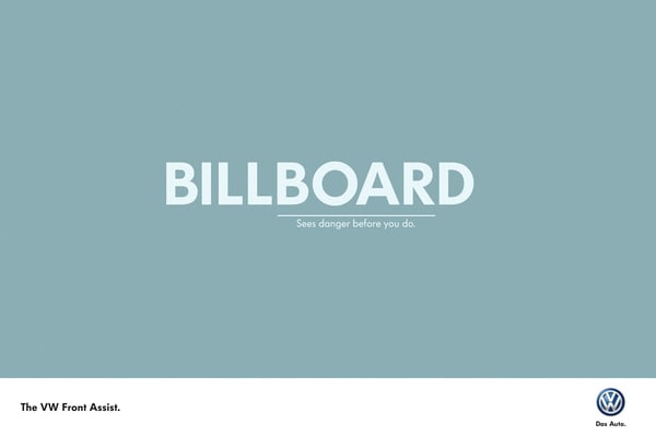
Use well placed graphics with plenty of space around them. Stylised logos, icons and line drawings are particularly effective.
Avoid lots of text; keep it to a heading and subheading. Event advertisement is the exception but even then; keep the details top level as the intention is people either turn up or to book tickets.
Colours
There is a difference between standing out and garishness. Whilst you want your poster, banner or billboard to be eye catching you don’t want your audience to be repulsed once it has succeeded.
Make sure you colour palette contrasts rather than clashes, and allows any text to be clearly visible from a distance.
It’s also worth keeping your palette limited to two or three colours for maximum impact. Unless you’re promoting a movie night or similar event then you should consider using more.
Also don’t forget, when designing for large print your artwork should be in CMYK rather than RGB.
Fonts and Text
Any text on your banner or billboard should be visible from quite a distance away however it should also be short and readable.
In the interests of clarity, serif fonts should be avoided where possible. This won’t always be the case as your company branding may use serif fonts.
This isn’t the end of the world just understand that any serif fonts used will have to work even harder in the space.
However not all sans serif fonts are suitable either. If the letters are too thick they can be hard to read. Too thin and they won’t make an impact (unless of course that’s the point). If the letters are too widely spaced the words will blend together.
It goes without saying to avoid any font that is overly stylised and too hard to read at a glance.
Layout
Carefully think about what you need to communicate. Identify the core message and condense it to make it as short and as impactful as possible.
Make sure the information is logically placed so it reads from left to right and moves down the space.
If you force your audience to decipher the advertisement you’re dramatically limiting the number of people who will understand it and respond positively.
Ask yourself how much of the information could be communicated non-verbally and where any images will sit.
If the background image on your banner or billboard is too bold or complicated it will swamp the text, making it unreadable.
Ideally images should occupy their own space with text sat next to, above or below it. By dividing up the space in this way you will ensure that all facets of the design remain clear and uncluttered.
Call to Action
Finally, perhaps the most important part of a billboard or banner is the call to action. Some brands, like Apple or Microsoft don’t use them because they simply don’t need them. Their products are highly desirable and beyond making their customers aware of the latest model or version they have to do little else to make sales.
For everyone else a call to action is the instruction to attend, visit, purchase, order or communicate in some way.
Carefully consider what you want that call to action to be. Whilst you may have a website, would it be better for the audience to call you today? Conversely would the website be a better source of information or a faster means to order?
Providing you know what the objective of the banner is, the best call to action should present itself. The important thing is to include one. Just make sure the details are correct and the call to action is not lost amongst extraneous details or complicated images.
Evans Graphics has a dedicated design team who can assist you with specific details, materials, finishes, dimensions and file formats.
Once you’re happy, send over the file and we’ll take care of the rest.
