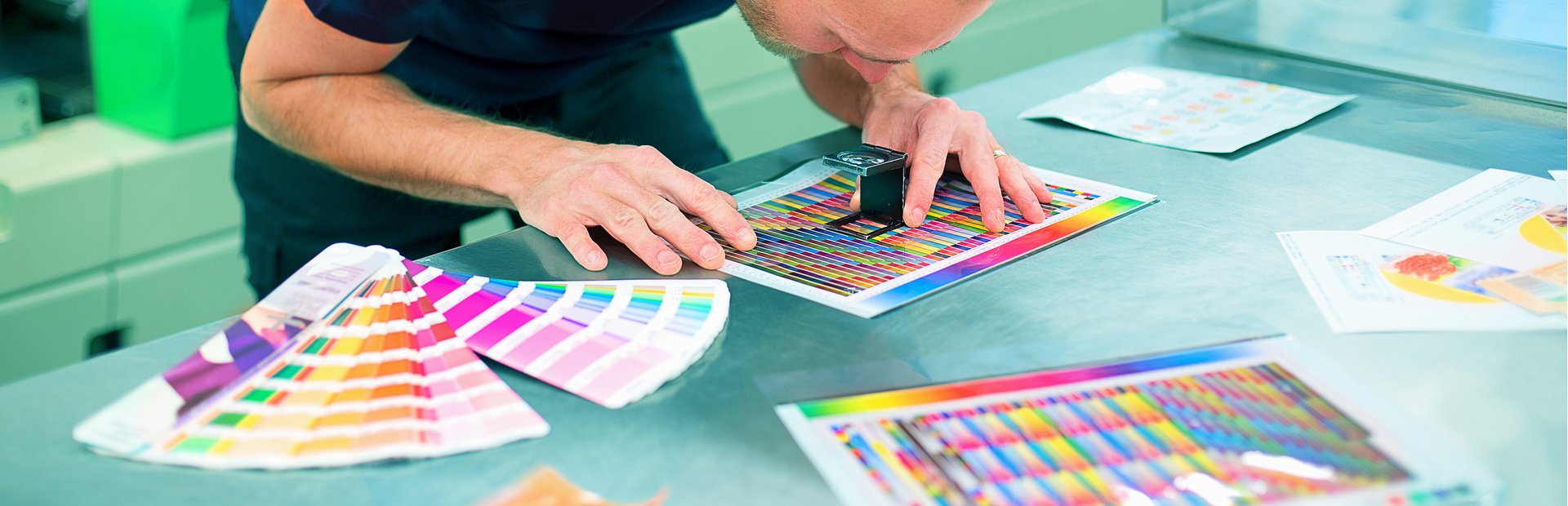
In the world of graphic design, the strategic use of colour means more than merely looking good. Colour is a communication tool that influences emotions, shapes perceptions, and drives consumer behaviour.
Colour psychology - the study of how colour affects human behaviour and decision-making - plays a big part in the effectiveness of design. By offering examples and some practical tips, we’ll see how much power colour holds within design, a principle expertly demonstrated by companies like Evans Graphics in the creation of effective visual communications.
Understanding Colour Psychology
The basis of colour psychology lies in its ability to evoke emotions and associations. For instance, red, known for its intensity, can stimulate feelings of passion and urgency, while blue, can instil a sense of calm and trust.
The application of principles like these is critical in graphic design, as the right colour choice can convey messages more effectively and evoke the desired response from the audience.
The Emotional Power of Colour
Colour’s impact on emotions is immediate and significant. Red, for example, has powerful connotations, evoking energy, and excitement, making it an ideal choice for brands aiming to capture attention and convey dynamism. Think about the logos of Red Bull or Netflix...
Blue, on the other hand, exudes calm and reliability, traits highly valued by corporations like the NHS and Facebook. Both use blue to project an image of stability and trust.
How Colour Shapes Perceptions
Colour not only influences emotions but also plays a big role in how we perceive brands and products. Green, for instance, is often associated with health, growth, and sustainability. This association is strategically leveraged by brands like Whole Foods, which uses green in its branding to emphasise its commitment to organic and environmentally friendly products.
In contrast, the colour black signifies sophistication and luxury, often used by high-end brands such as Rolex to convey a sense of exclusivity and elegance.
This strategic use of colour influences consumer perception, positioning these brands within specific market segments and enhancing overall brand image.
Steering Consumer Behaviour
The influence of colour extends into the realm of consumer behaviour, affecting how brands are recognised, decisions are made, and products are purchased.
Orange, known for its ability to encourage impulsive behaviour, is an excellent choice for call-to-action buttons or sale announcements, aiming to attract attention and prompt immediate action.
Amazon’s use of bright yellow for its “Add to Cart” buttons meanwhile leverages this colour's cheerful and optimistic connotations to encourage us to complete our purchases.
Purple, symbolising creativity and luxury, appeals to those seeking distinction and quality. This colour’s unique position helps products stand out, offering a perception of indulgence and premium quality that can influence purchasing decisions. Think about Premier Inn and Nectar.
Leveraging Colour Effectively: Practical Strategies
Understanding Your Audience: Tailoring colour choices to fit the cultural and demographic context of your target audience ensures that the colours you use resonate emotionally and are culturally appropriate.
Maintaining Brand Consistency:
Consistent colour schemes across branding and marketing materials reinforce brand identity and help recognition, establishing a strong visual presence.
Contrast:
Employing contrasting colours can enhance readability and highlight key elements, ensuring the intended message is delivered clearly and effectively.
Staying Trend-aware: While consistency is key, being aware of and integrating current colour trends can inject freshness into your brand’s visual identity, keeping it relevant and engaging.
A Case Study in Colour Psychology
At Evans Graphics our portfolio demonstrates a keen understanding of how colour choices can impact the appeal and effectiveness of visual communications. By helping our customers align colour strategies with brand values and audience preferences, we help produce designs that are not only visually striking but deeply resonate with audiences.
Conclusion
The application of colour psychology in graphic design is indispensable for creating impactful, visual communications. Its influence on emotions, perceptions, and consumer behaviour highlights the importance of a thoughtful approach to colour.
When it comes to design, colour stands out as a critical tool for engaging audiences, conveying messages, and influencing decisions. The study and application of colour psychology are essential for designers looking to harness the full potential of their work, ensuring that their designs not only catch the eye but also capture the imagination.
