Now that work from home restrictions are being lifted, many employees are starting to return to the workplace. While remote and flexible working have many benefits, the office still has an important role to play in your business.
Many employers will agree that the office is at the heart of what they do, providing a supportive environment for colleagues to collaborate and socialise, as well as giving clients a clearer picture of who you are and how the team operates.
Signage can emphasise your business’s visual identity as well as engage and impress visitors to your premises. With a plethora of materials to choose from, not to mention design options, we had a look at some of the best examples of modern office signage…
Brands are front and centre
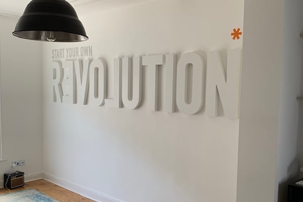
Office branding creates a clear and consistent message when establishing your corporate identity. It distinguishes your business from your competitors, and gives your workplace a professional atmosphere.
Your brand signage could incorporate elements of your logo, colours, typeface, and symbols into its design.
You may also want to consider the space; little touches such as desk signs and window displays can be just as effective as larger banners and hanging signs.
See how Skype have achieved this very effect...
Along with Google...
Offices are going green
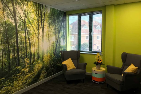
Plants aren’t just for windowsills! Many businesses are now trying to bring the outdoors inside with signage that incorporates high quality artificial materials that emulate the look of real flowers.
Not only do these signs catch the eye of potential clients, they require none of the maintenance that real foliage does.
If you’re a business related to horticulture and the outdoors, you may want to consider adding artificial green signage to your office.
That’s what Lacoste have done…
So too the Natureza Dental Practice...
Directional signage is key

Having signs that show staff and clients where things are and where they need to go is important in any office. Directional signage is vital for any modern working environment and - if used creatively - can prove a great opportunity to impress as well as inform.
Lots of businesses are getting creative with their signage from colourful wayfinding lines and arrows on the floor to large wall signs incorporating funky designs. Who said informative signage couldn’t be fun?
Take a look at how Fabrikbrands proved the concept…
Company values are made clear
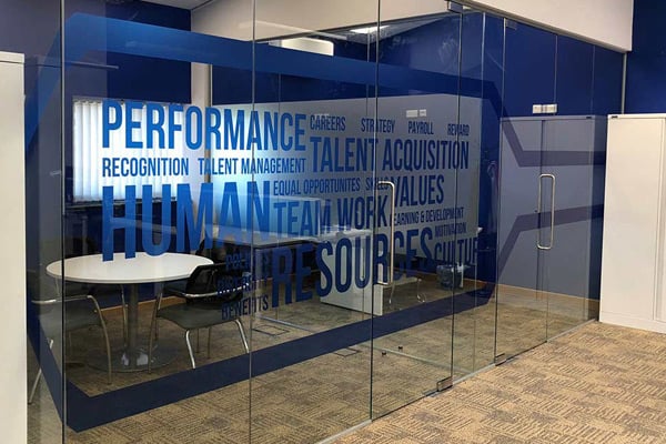
Lastly, it’s not just about how companies are using the space, it’s why.
While brand signage is great for establishing who you are, you should also make use of signage that digs deeper and allows clients to see what you stand for.
Whether you have a seasonal or temporary initiative you want to share through banners and boards, or simply want to showcase your company vision in a permanent mural, there are numerous ways to present your core values.
Here’s how Merchology have done so…
And Mindspace...
Office signage can help transform your place of work into a modern office you can truly be proud of. If you’d create your own, with the help of our expert team, please request a quote or contact us today.


