Here at Evans Graphics we keep a close eye on design trends in a bid to stay ahead of the creative curve. Of the many concepts attracting interest just now, Contrasting Typography is perhaps the most intriguing.
So what is it and how does it impact our artwork?
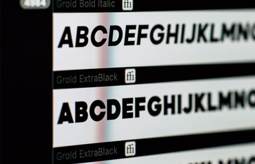
In many respects this tactic is self-explanatory. Contrasting Typography is the art of combining multiple fonts into a singular design.
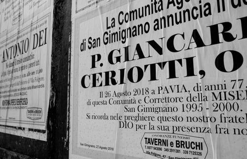
A relatively new concept, it’s become synonymous with infographics in recent years. Already intended as visual aids, the meshing of fonts compels readers to both look again and look closer. Here’s a few examples…
https://www.pinterest.co.uk/giovannicervant/contrast-type-examples/
Pair the right typography and your design will stand out from the crowd, drawing interest and engagement alike. Misjudge the combination however and you can just as easily confound and alienate. Indeed combining fonts is a challenge but one more designers are seemingly rising to.
Challenge
A classic risk and reward scenario, this process is difficult to master but worth the time and effort. Throwing any old mix together will not suffice. In fact this can lead to what is known as Font Vomit – an ill-judged experiment that is both uninspired and ugly.
To avoid that common pitfall, there are a handful of best practices every designer should follow. They are as follows…
1 Rein It In
While there is nothing wrong with being adventurous and reckless abandon is often encouraged in art circles, it serves to limit any combination of fonts to avoid the dreaded Vomit scenario.
Aiming for between 3 and 5 styles is sensible. This affords creatives enough leeway to make an impression, without rendering their design intimidating and unreadable.
While it’s possible to initially pique interest with the inclusion of differing fonts, you’re just as likely to disinterest people if you over-do it.
Remember also that the more you incorporate, the harder it becomes to make everything fit. There should always be an element of synergy in the final design.
Most importantly, your key messaging should be the most legible. Having drawn a crowd – whether that on or offline – you want to get your message across… particularly if you’re marketing a product or service.
2 Opposites Attract
A degree of experimentation will help you find the best combination of fonts but as a rule of thumb, opposites often attract.
When it comes to design this is realised when pairing what could be deemed fat fonts with slimmer alternatives. Similarly, upper and lower case can make for an unlikely but effective blend.
As for fonts themselves, marrying serif with sans serif is a clear example of how this can pay off.
Another reason to seek out unlikely combinations is to avoid using those that are too similar. Not only is this less impactful, it can be seen as inadvertent and reflect poorly on whatever you’re looking to promote.
3 Creating A Mood
In sharp contrast to point 2, differing moods will not work together. That’s why it’s vitally important to select typefaces that complement one another in tone. Pairing a traditional font such as Times New Roman with a modern equivalent like Cornelia will not strike the right balance. Warm and cool clash, so too formal and informal…
Typography helps establish a mood and while your fonts can alternate, this should never change.
4 Kerning
Settling on your 3-5 fonts is one thing, deploying them is quite another. With all different shapes and sizes to manage, this can quickly turn the inspired into the idiotic. This is where kerning comes to the fore and the rescue.
Defined as ‘the adjustment of space between letters or words to achieve a visually pleasing result’, this process will line everything up and make things presentable.
Those new to the process are advised to perfect tracking and leading alike. The former involves the spacing of groups of letters, the latter the spacing between actual lines of type.
Kerning, when done right, will professionalise the chaotic.
5 Know Your History
Finally designers are advised to research the fonts considered for a design incorporating mixed typography. It’s an unwritten rule that those from the same historical period are more likely to complement one another than those 100 years or more apart.
Which you plump for will ultimately depend on personal taste but sticking to the same era will help you strike the right note.
Design is ever evolving and combining fonts, once viewed as bad practice, is now encouraged for certain print collateral. If you’re attempting to do so for the very first time, adhere to these five principles and you’ll achieve the desired effect.
